home sweet home. living room.
Design is defined by light and shade,
and appropriate lighting is enormously important.
Albert Hadley, The Story of America's Preeminent Interior Designer
our theme was "comfortable". the house has a lofty, light feel to it--high ceilings, old archways, original moulding. we didn't want to cram in furniture--but wanted to make efficient use of our space. thankfully, the furniture we already had worked fabulously.
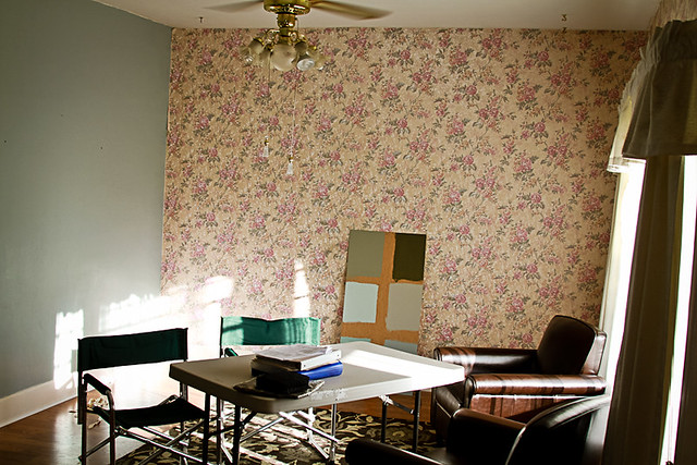
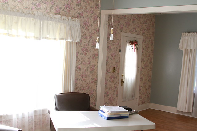
first the wallpaper had to come down. OH MY GOSH was that a nightmare.
we even discovered a window behind the wallpaper. YES A WINDOW. they'd just screwed up plywood & glued over the top of it. my dad spent a weekend here & was kind enough to mud the entire wall for us.
come to find out, this little home was one of the first in the neighborhood. and that window gave the tenants a fabulous view of the neighbors living room when building picked up.
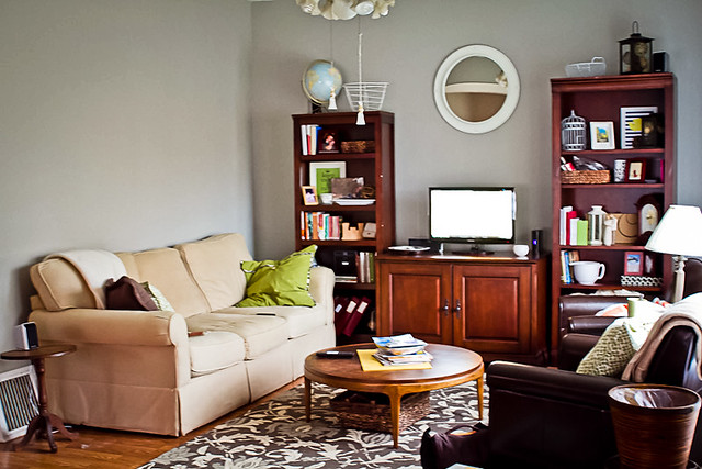
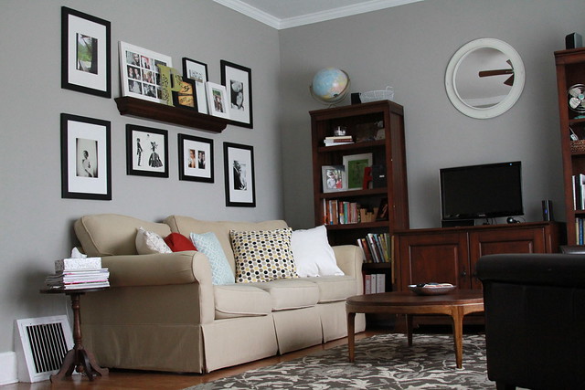
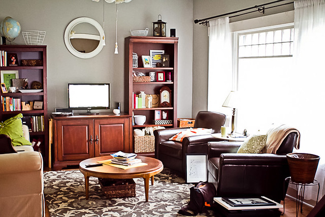
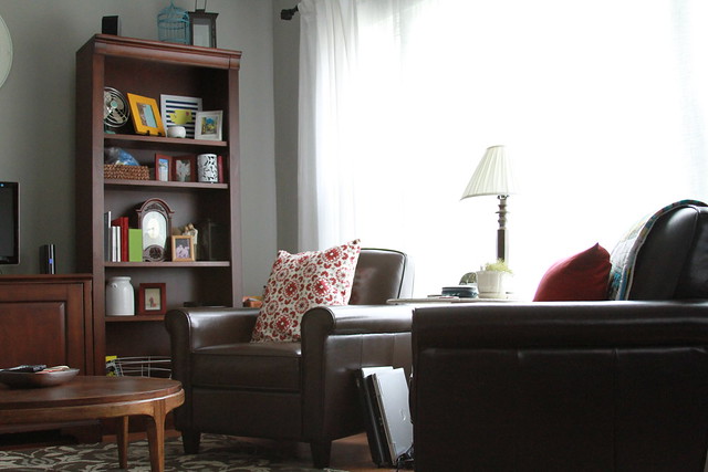
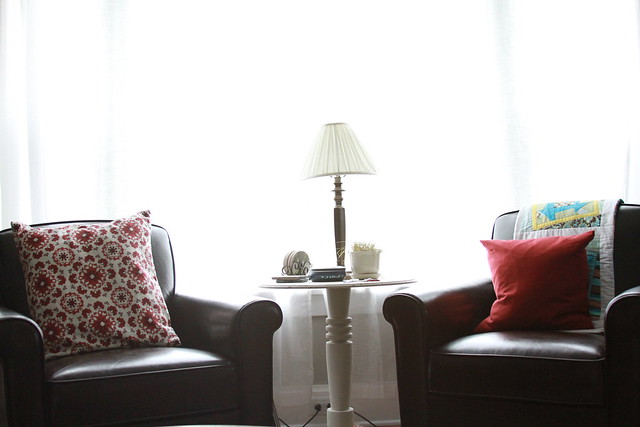
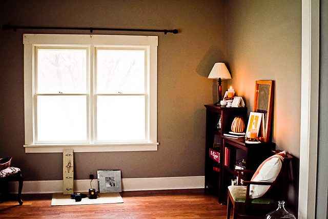
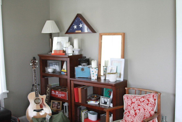
we chose a light gray for the living room--and the contrast between cool colors & warm wood was just what we wanted. i still change our couch pillow covers & shelf arrangements about every 4 months--so we decided to let the color rotate throughout the year in the form of new photos & accessories.
so we went from this:
to this:
and finally to this:
{ehem...i might have gone dumpster diving after a local college got out...OH MY GOSH i'm doing it every year. totally another post for a different time.}
we went from this:
to this:
and finally to this:
***
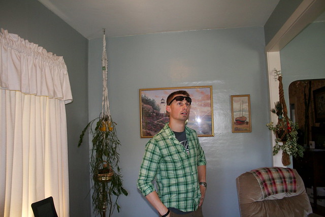
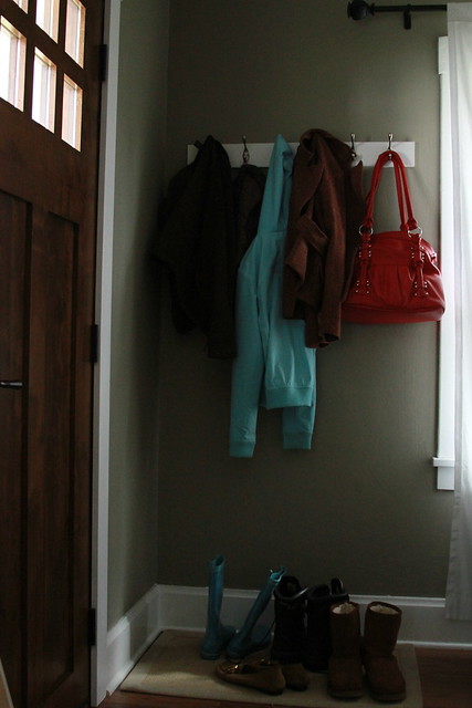
the entry way was another entity entirely. we wanted it to be a distinct space--but blend in well. as a matter of fact, in taking down the wallpaper, we discovered that the entry way used to be the front porch! the front door used to go straight into the dining room.
we chose a slightly darker grey for the walls...& it has since just evolved into a functional, perhaps even fashionable space that actually gets used.
you can see a little peek of it in this photo:
and another (ack!) peek in this one:
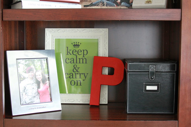
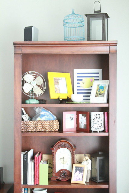
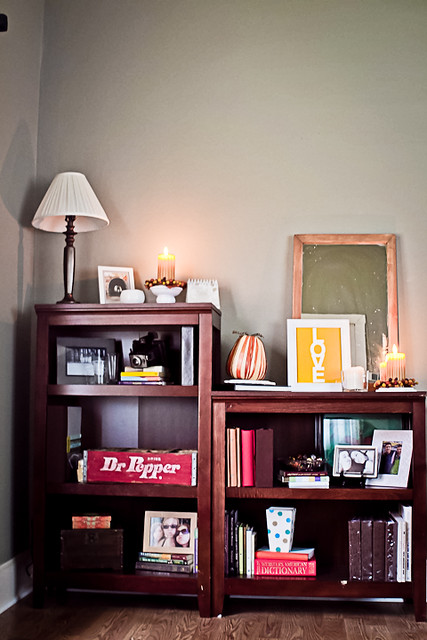
we already had these shelves...
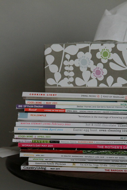
this was the fall set-up:
and with a little picture hanging, here it is now:



2 comments:
YOU ARE KILLING ME! I am the most impatient person ever and this is like dangling a giant apple pie in my face and saying SYKE, you can have it tomorrow! ha ha! I'm loving it thought. So glad you have time to blog now. Keep the teases coming!
Oh my gosh I love your decorating! I especially LOVE the wall with the shelf and all of the pictures in your living room! Well done J!
Post a Comment